37 Demo
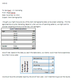
For this assignment we had to make a memo that consisted of two tables, with different borders and shading. The skills we needed to use to create this were Microsoft Word and the different effects you can use on tables. By creating this piece of work I learned that even though it appears in the picture that the cells are merged, it could be a color theme that just gets rid of the lines between cells. In this assignment I created the example image well, I followed the directions and used the themes described. What I could have done better in this assignment is to use different themes so it was more appealing to the viewer.
53 Voyager
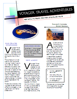
In the assignment on the left we had to create a three column newsletter. To complete this assignment we had to use newly learned skills about Microsoft Publisher. By creating this piece of work I've learned how to create a newletter on publisher by using a template. Also, how to link and unlink text boxes. In this assignment I accurately modeled the example newsletter, I added clip art and other pictures in order to take up some white space, and I clearly executed the assignment efficiently. To improve my work on this assignment I could have added a border, as well as find a template that better modeled the example in the book.
Activity 12 Teen USA Payroll
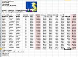
In the Activity 12 Teen USA Payroll we needed to make a chart on 19 people that showed the about of money they made per hour, their hours work, the gross and net pay, as well as all of their taxes. In order to do this assignment we needed to show Microsoft Excel skills. The skills that needed to be learned prior to this activity would be how to correctly enter the data. This data includes how to use formulas as well as how to copy a formula down a column to save time. By creating this piece of work I learned how to efficiently make a chart
that shows data for many people in an organized fashion. In this assignment I added clipart to enhance the viewer’s interest in my work, as well as bolding certain words to draw attention and using the color fill tool in some columns to shows change in important rates. To improve my work in this assignment I would use more effects such as coloring tools, as well as sizing to enhance the likability of the assignment.
that shows data for many people in an organized fashion. In this assignment I added clipart to enhance the viewer’s interest in my work, as well as bolding certain words to draw attention and using the color fill tool in some columns to shows change in important rates. To improve my work in this assignment I would use more effects such as coloring tools, as well as sizing to enhance the likability of the assignment.
Career Project
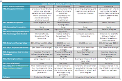
In my updated Career Research Project assignment I had to convert all of my information about my eight selected careers into a chart for easier organization and capability of reading the information faster and with less
space being taken up. To complete this assignment Microsoft Word skills were needed. Such as, being able to create a chart, using sizing tools to change the size of the row and columns, and using different color patters to enhance the picture that would be presented before the viewer. By creating this assignment I learned how to effectively display data in a chart that explained almost all aspects of my career choices in an effective way. What I did well in this assignment was producing a chart that showed my interests and strengths in certain careers. Also, the assignment let me gather information about certain careers that I am interested in that I didn’t know about before, such as salary and the amount of job growth by the time I will be in the field. What I could have done differently was the color choices I made, as well as how I set up the columns of careers. I could have made the columns go by my interest from favorite to least favorite or vice versa, to display a more exact chart of my goal careers for my future.
space being taken up. To complete this assignment Microsoft Word skills were needed. Such as, being able to create a chart, using sizing tools to change the size of the row and columns, and using different color patters to enhance the picture that would be presented before the viewer. By creating this assignment I learned how to effectively display data in a chart that explained almost all aspects of my career choices in an effective way. What I did well in this assignment was producing a chart that showed my interests and strengths in certain careers. Also, the assignment let me gather information about certain careers that I am interested in that I didn’t know about before, such as salary and the amount of job growth by the time I will be in the field. What I could have done differently was the color choices I made, as well as how I set up the columns of careers. I could have made the columns go by my interest from favorite to least favorite or vice versa, to display a more exact chart of my goal careers for my future.
