Career Data Excel Charts & Analysis
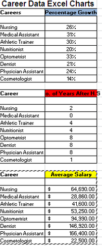
In this assignment we had to create three charts based on our top eight career choices. Each chart represented something different, such as, percentage growth, education after high school and the average salary. The skills I needed to use to create this assignment was different things in Excel. We had to create tables, as well as charts for each table. For each chart we had to shade different colors and then change the tab color for each chart to the matching color. By creating this piece of work I was able to visualize my top careers more precisely because the top three concerns for choosing a career were present. If I could change something about my work, I would probably make sure the colors I chose for the tabs matched the charts. If i did this the charts would be more visually appealing to the eye.
In this assignment we had to create a blog on Glogster about our top career choice. In our blog we had to include what our career was, the skills you need, the schooling you need as well as the average salary you will make in that career. The skills I needed to create this project were learned through trial and error of just testing out new things. By creating this assignment I was able to learn how to use a new type of software to display my top career choice. If I could change something about my project I would make the colors work together better and crop the white space off of existing photos that I embedded in my blog.
